
gramm.genau (2022)
Visual System
Task:
Create a new brand style for gramm.genau, a privately owned shop that sells loose groceries without packaging and runs an adjacent zero-waste café.
Concept:
gramm.genau doesn't simply create a space enabling environmental friendly purchasing of groceries, coffee and cake, they create a space for a new way of life. That space is mirrored in the new logo design, which incorporates all visual specifications making up the new brand design for gramm.genau.
Time:
8 weeks

Modular System
This modular system creates a balance between consistent brand communication and creative flexibility. At its core is the logo, which is a demonstration of all visual specifications that make up the entire visual style. But even the logo can vary, without compromising the visual system's integrity - as long as it adheres to the rules.
Logo
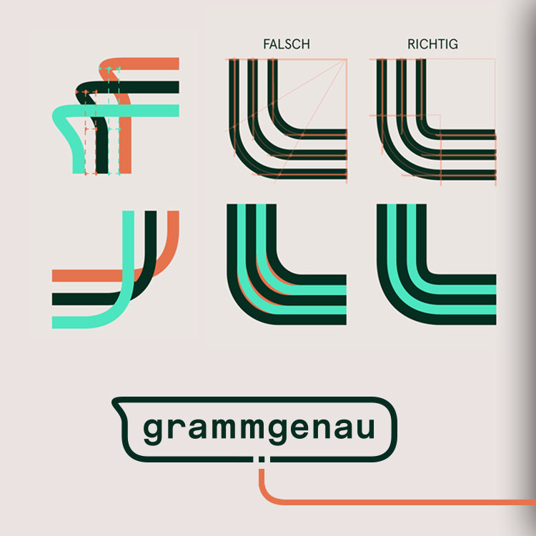
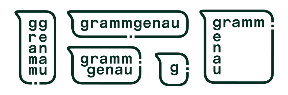
The logo is made of two parts. One is the text, reintroducing the complete name (including the dot) to the logo. The other part consists of lines that represent the business, its grocery shop and its zero-waste café.
The lines form the shape of a measuring cup, which was a part of the original design. As the shape of the logo varies, so does the type of measuring cup it represents.

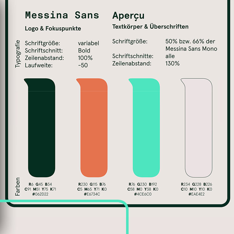
The font used for the logo is called Messina Sans Mono. In order for these letters to create the desired look, the width of the letter "m" needs to be slightly increased. Additionally, the line spacing of the vertically written word must be adjusted to equal the distance between the horizontally written letters.
The line thickness is determined by the font size. The dot of the company's name will be equal to the thickness of the lines.

Each of the lines has four unique corners that are not merely copies of one another. Every single one has different rules as to how it is constructed.
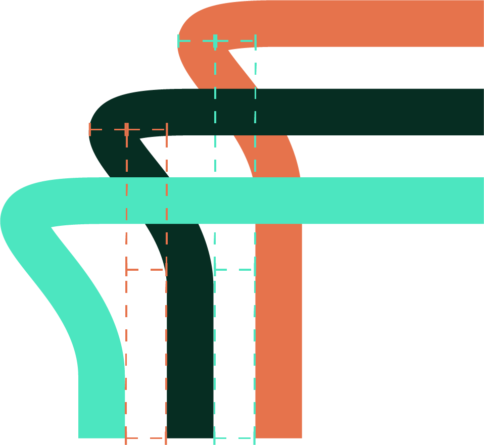
The first corner, the mouth of the measuring cup, is created through a protrusion of the line by an amount equal to two gaps between the lines.


The corner on the opposite side is comprised of equally rounded lines. However, overlaying them leaves a tiny hole inbetween, which must be filled, in order to avoid unwanted showing of the background.
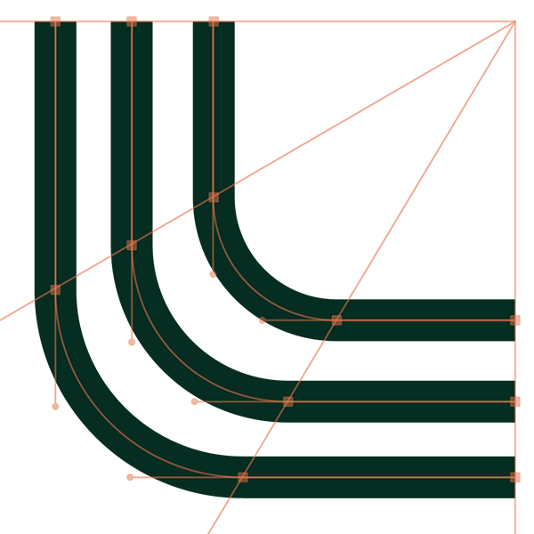

The remaining corners must be bent in a way that leaves the gap between the lines equal at all times. Simply copying the angle of the corner would create small, unwanted openings. This can be avoided by aligning the anchor points of each vector line horizontally and vertically.


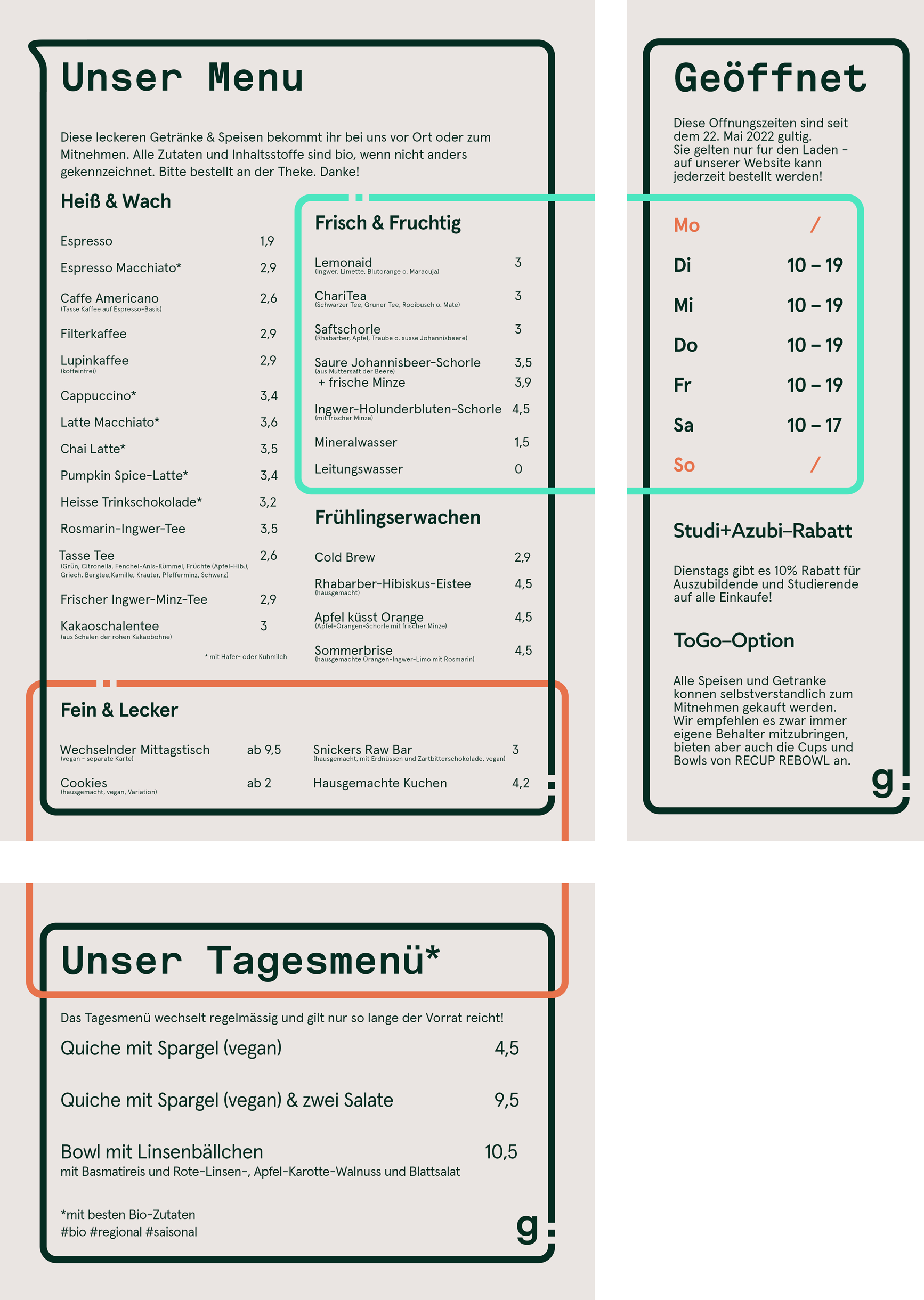
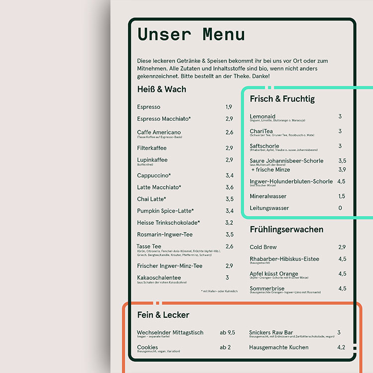
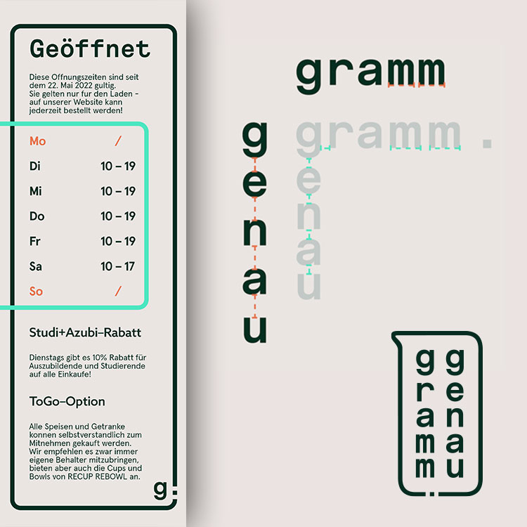
This menu and info sheet demonstrate the use of each brand element that was just introduced. Despite the fact that their placement was not pre-determined, the brand's integrity was preserved, because these documents were created within the design system, adhering to its basic rules.