ISOPLAKATIV (2020)
Communication Design
Task:
Find and recreate a poster by improving on its visual language. I picked a poster by the Frankfurt Opera.
Concept:
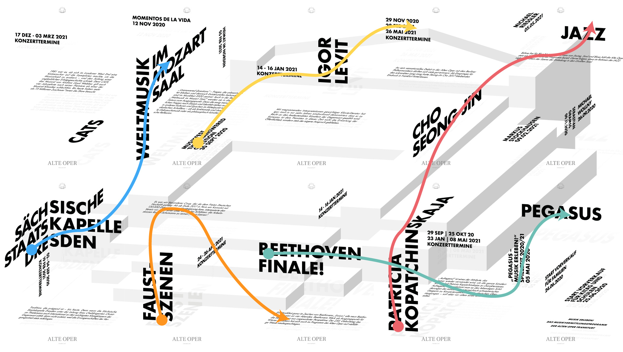
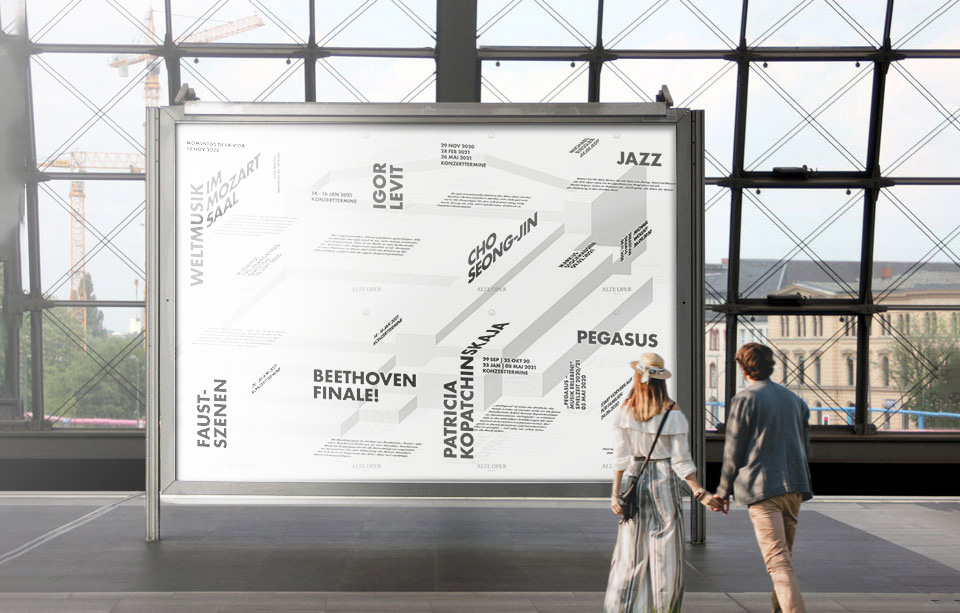
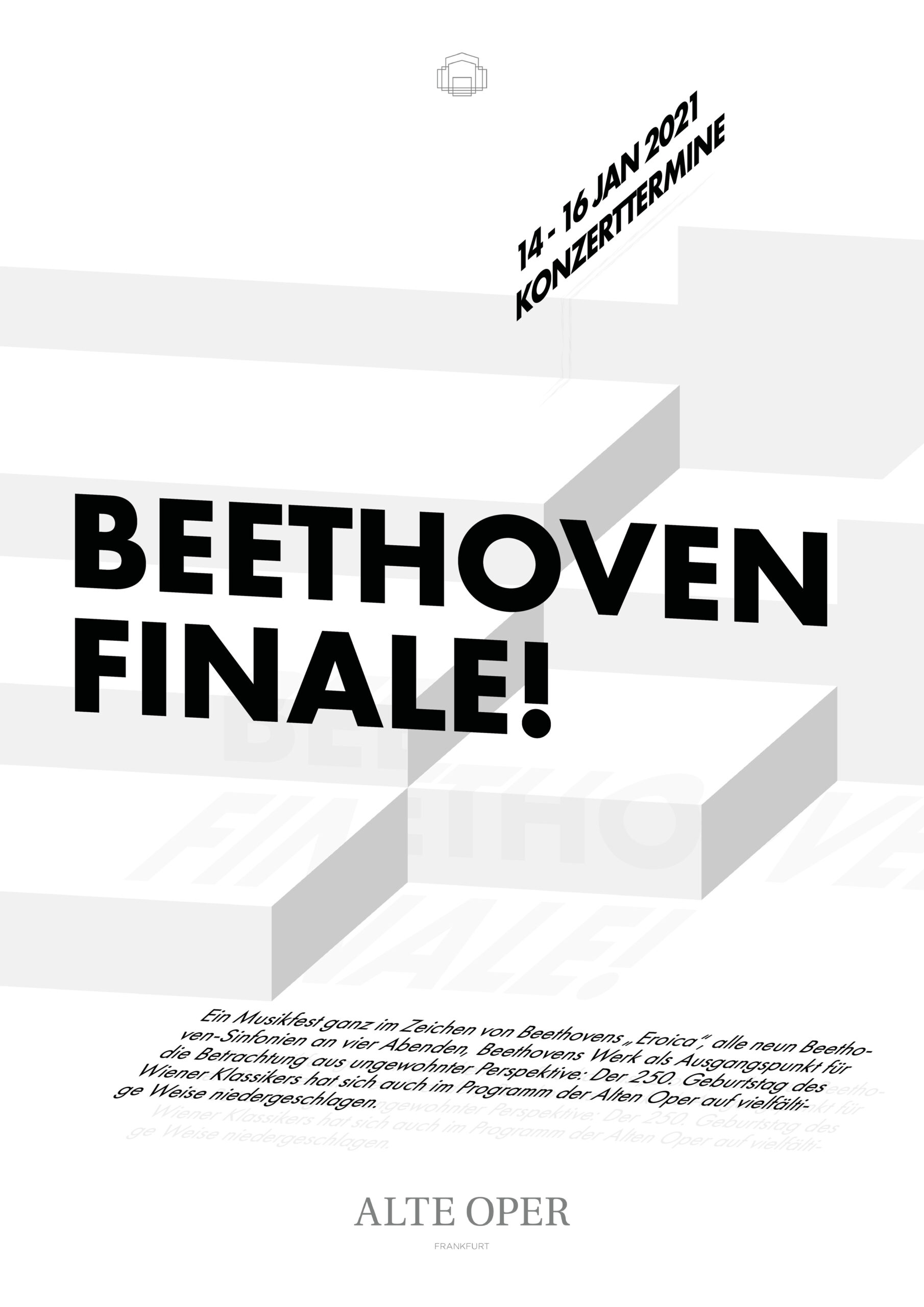
The logo of the Frankfurt Opera was placed in an isometric space with the entire program of 20/21 being written into that same 3D space.
Time:
4 weeks
old design new design
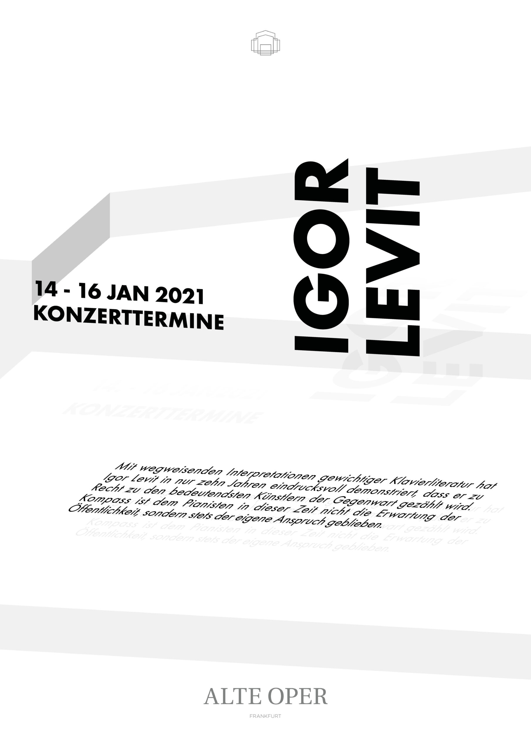
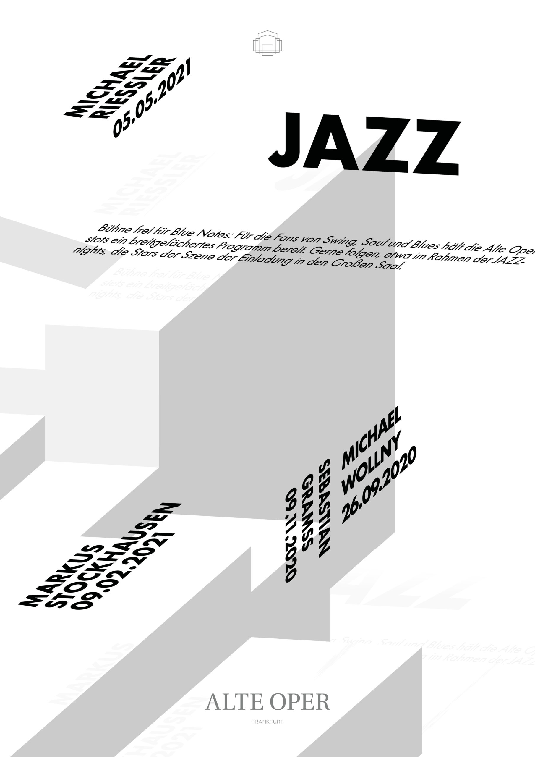
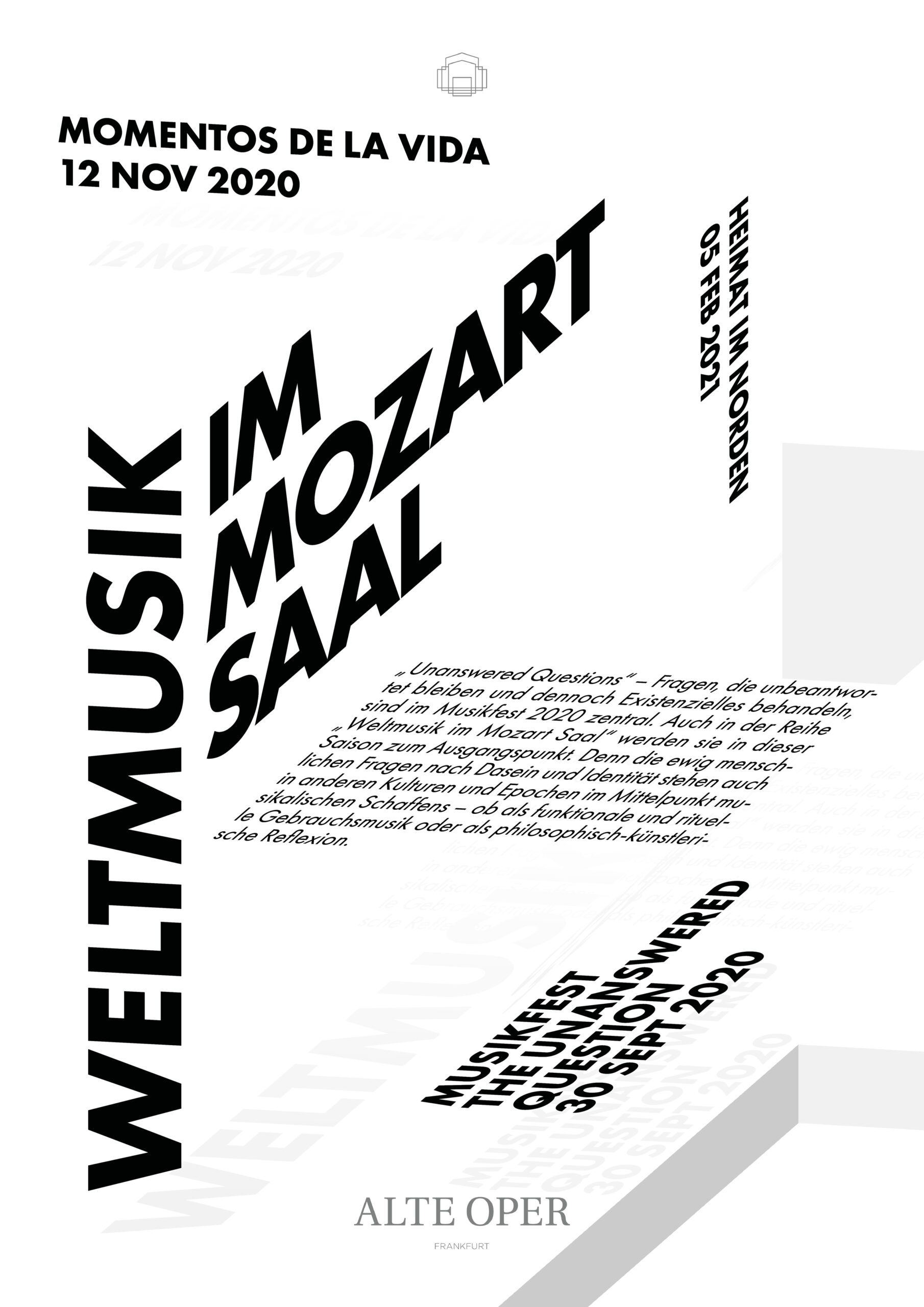
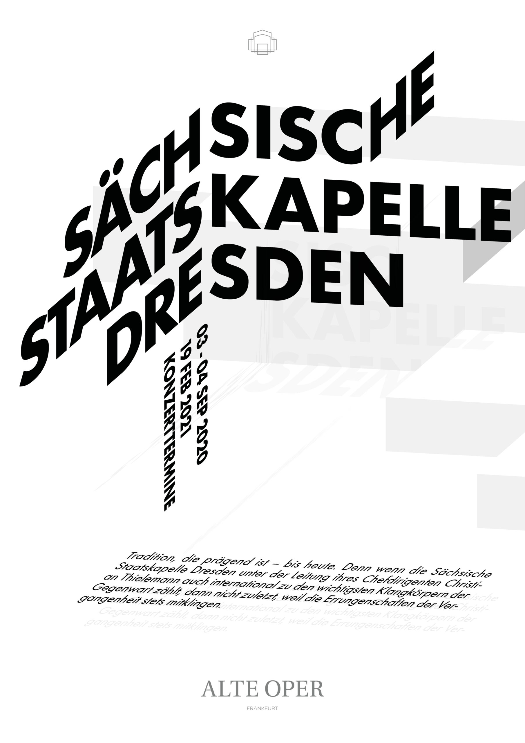
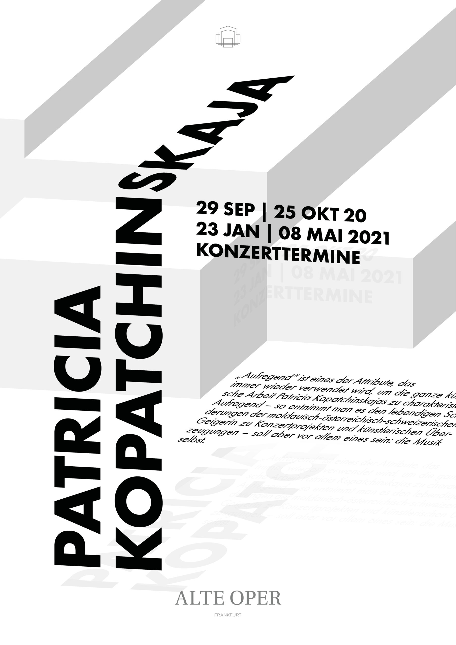
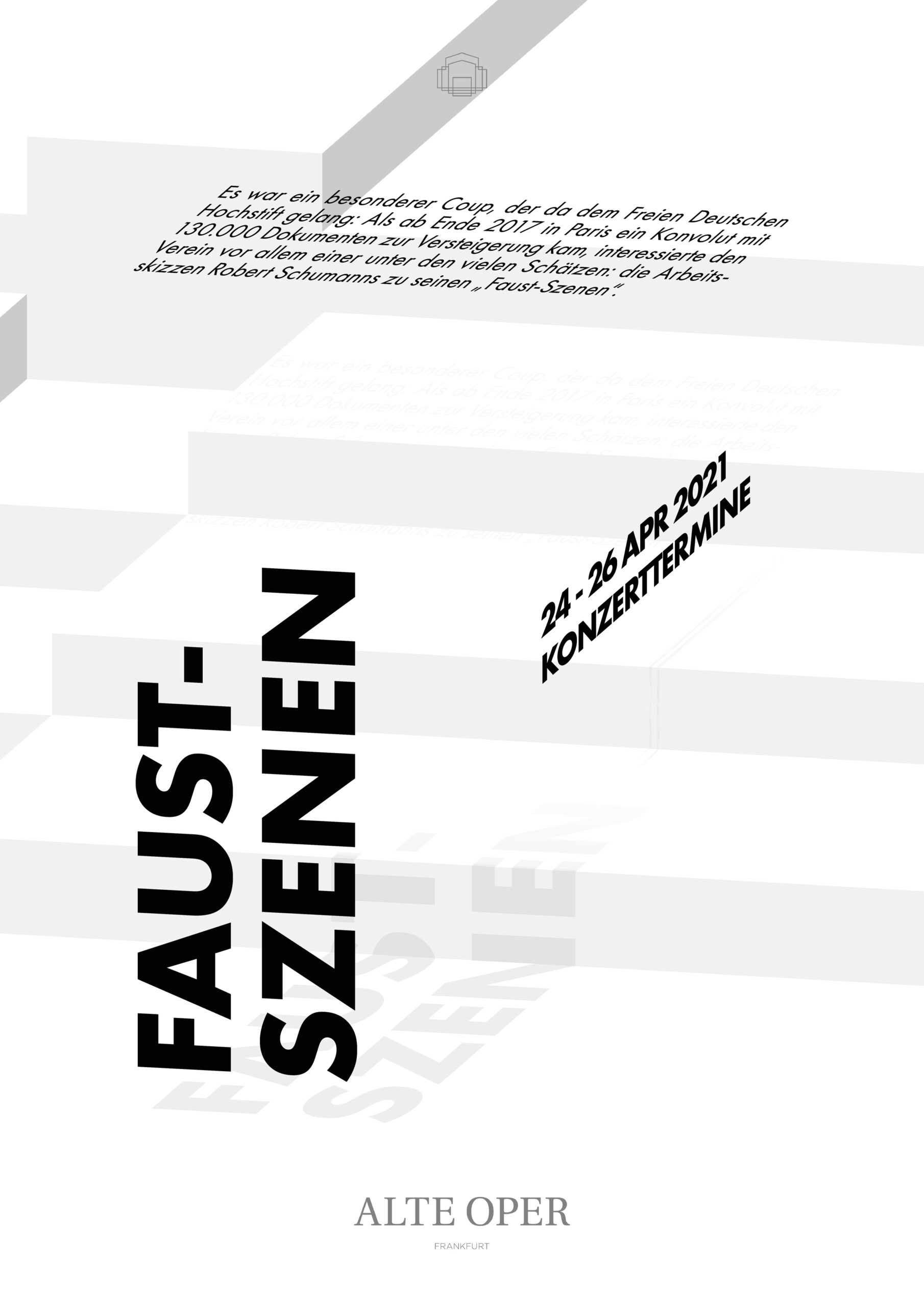
Isoplakativ is a word creation that combines the isometric visual style and the German term "plakativ" that can be translated as "bold", "eye-catching" and "visualizing".
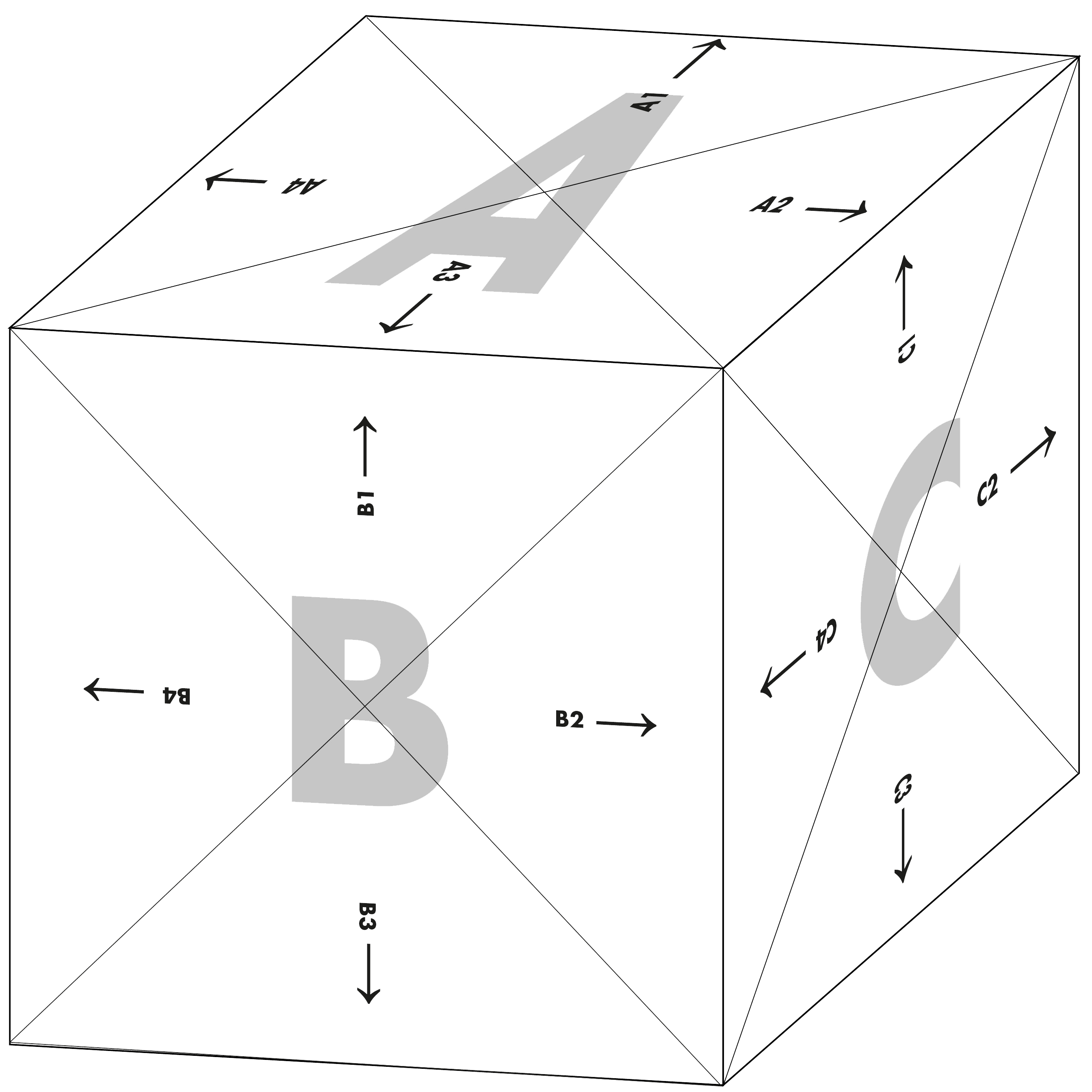
Isometric Space
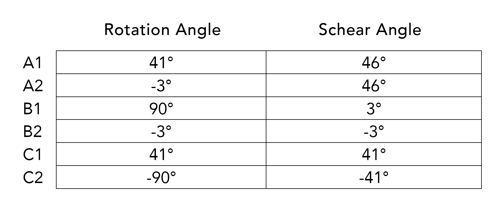
Central visual element of Isoplakativ is the placing of all single posters in a certain order to create a joint big picture. In combination the entirety of posters create an isometric image that was previously only hinted at with abstract shapes of grey. Combined they show the logo of the Alte Oper Frankfurt that was bent and skewed in a very specific way with a shear angle of 43° and an axes angle of -16°:


Dimensions
In order to place the text elements correctly along the axes of a newly created isometric space, they have to adhere to specific angles as well. In order to define these angles, I first had to define all dimensions and directions in which text could be placed.
In a three-dimensional space there are, obviously, three dimensions, each with four directions - both indicated by a letter (A, B, C) and a number (1-4). Since text becomes unreadable in certain directions, only directions 1 and 2 were considered appropriate for text to be displayed. The final degrees are defined as:
Communication Hierarchy
Isoplakativ follows the traditional hierarchical structure of three communication priorities:
- the artist or name of the event
- the date
- the description
Each communication priority has a unique font style that supports its placement in this specific isometric space. Font size, line spacing, letter spacing as well as character height and width are uniquely defined for this exact purpose.
All texts are to be aligned to the left and in order to make the longest text, the description, easily readable, it is bound to be displayed only on A2, barring every other communication priority from using that dimension and direction. The sharing of a specific description style on each poster creates a connection between the posters that adds another element of alignment. Despite this exclusivity, enough variety is created by the combination of dimensions and directions across and within individual priorities.
Shadows
The three-dimensional space that is created by the isometric logo and the placing of the text is further reinforced by the shadows that accompany each communication hierarchy. In order to create more variety inside a monchromatic visual style that benefits mainly from positioning and placing, the shadows are positioned based on three different distances to the text. The further away the shadow is placed, the further away the text appears. Logically the shadow becomes lighter the further away the text is.
Basic Principles
Having defined the elements that compose the result, I have also defined basic rules that determine the visualization and a certain level of similarity among all posters.
- The posters must make sense in their individual and in their combined state
- A combined group of posters must display an isometric image
- A group of posters is defined as an equal number between 2 and 10
- All posters share the same size
- Each dimension and direction must be used only once per communication hierarchy
- While all three shadow distances must be used per poster, each distance must be assigned exclusively to one communication hierarchy
An Invitation to Explore
Combined and displayed the entirety of posters invites the observer to start exploring the program of Alte Oper Frankfurt bei randomly picking a starting point and following the text whereever it may lead. A playful and joyous way of learning about the many events in whatever level of detail is relevant for every individual.